When choosing new colors for your house makeover, you should always make sure whether they're trendy or not.
Not just colors, but even some particular shades can make or break the aesthetics of your house.
Here are a few tips on what colors you should avoid when creating a new design for your interior.
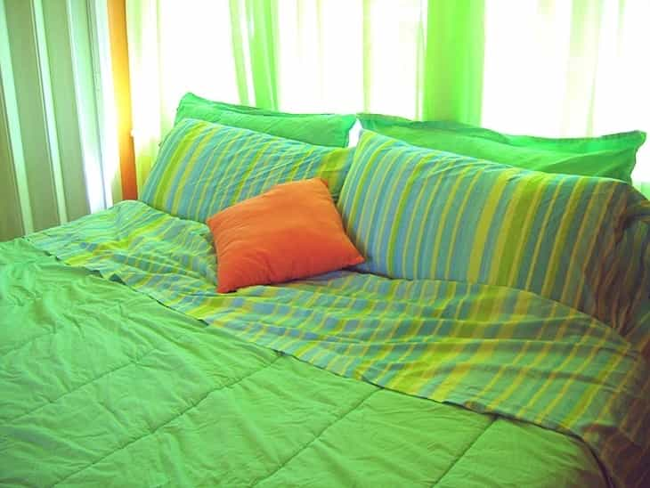
Avocado Green
This earthy green tone was widely used in the 1960s and 1970s.
While it once symbolized freshness, today it can make a room seem dated.

Considered too retro, using it in large amounts may not align with modern aesthetics.
Mustard Yellow
Popular in the 1970s, mustard yellow added warmth to interiors.
However, its prominence in that era has led to a perception of outdatedness.
Using this color sparingly or in combination with contemporary hues can be more appealing.
Pastel Pink
Light pink was a common choice in the 1980s for a soft, feminine touch.
In modern design, it might be seen as overly saccharine or nostalgic.
Opting for more neutral pinks or diverse color schemes is a current trend.
Dull Beige
Beige was a go-to color for a neutral palette, especially in the 1990s.
However, excessive use of dull beige can result in a lack of vibrancy.
Contemporary design leans towards bolder and more diverse color selections.
Terracotta Orange
Terracotta shades were prevalent in the early 2000s.
While a touch of warmth is timeless, too much terracotta can feel outdated.
Balancing it with modern accents or opting for more muted oranges is recommended.
Mauve
Mauve, a pale purple, found popularity in the 1980s.
Its association with past trends may hinder its contemporary appeal.
Exploring alternative purples or combining with modern elements can update the look.
Salmon Pink
Salmon pink, reminiscent of the 1950s, may feel too traditional.
Contemporary preferences lean towards adaptable and diverse shades of pink.
Choosing hues with more versatility can provide a refreshed aesthetic.
Olive Green
Olive green was a prevalent choice in the mid-20th century.
While earthy tones remain timeless, an excess of olive green might feel outdated.
Incorporating it as an accent or balancing with modern neutrals can create a harmonious look.
Previously, we talked about choosing a candlestick.


